What Makes a Dashboard Design User-Friendly?
Written by UIDesignz Sep 10, 2025 6 min read
Last updated: Sep 11 2025
A dashboard is more than a collection of charts and numbers. A dashboard should feel like a conversation, not a puzzle. When someone opens it, they shouldn’t be wondering “What does this mean?” but instead thinking “Here’s what I should do next.” That’s the mark of a user-friendly dashboard: it doesn’t just display data, it delivers clarity, direction, and confidence.
At our UI UX Design Company, we’ve seen one pattern hold true: the most effective dashboards are the ones that feel invisible. They don’t force users to think about the design. They let the data speak. So, what makes a dashboard truly user-friendly? Let’s break it down.
Table of Contents
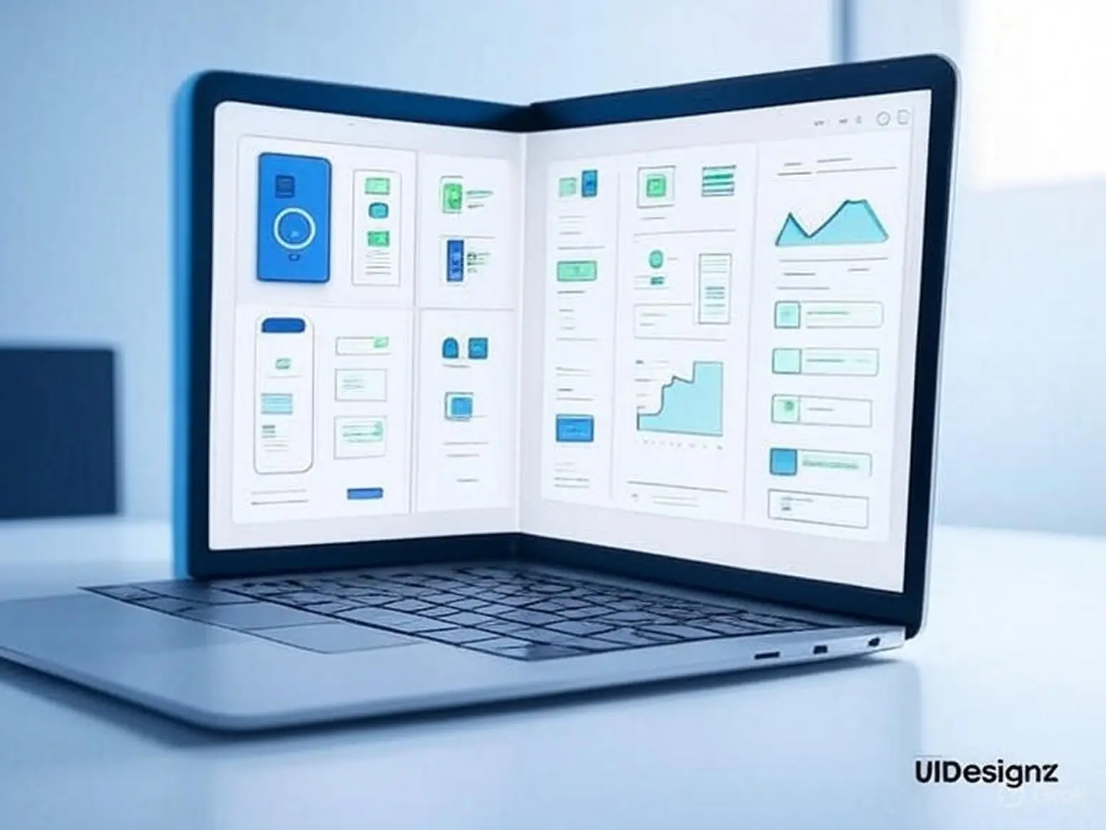
Clear Focused Information

Clear-Focused-Information (Pinterest)
Open a dashboard, and the first 10 seconds decide everything. That’s how long the average user spends scanning before they decide whether it’s useful or not. If your key metrics aren’t immediately clear, you’ve lost them.
User-friendly dashboards start with prioritization. Key performance indicators (KPIs) such as revenue, active users, or conversion rates should be impossible to miss. Supporting data should be secondary, accessible, but not fighting for attention. Explore our dashboard design services to see how we create dashboards that highlight what matters most.
Forrester research found that clear data visualization improves decision-making speed by 28% (Forrester, 2022). In industries where timing is everything, those seconds translate into real competitive advantage.
The takeaway- clarity isn’t about minimalism. It’s about helping your users find meaning fast.
Smart Data Visualization

Smart-Data-Visualization (LinkedIn)
The design of a dashboard lives or dies by how it presents numbers. Charts are storytelling tools. When they’re chosen well, they make data obvious. When they’re chosen poorly, they make it confusing.
- A line chart shows trends over time.
- A bar chart makes comparisons between categories easy.
- A pie chart should only appear when there are very few categories, otherwise it’s unreadable.
The Nielsen Norman Group found that well-chosen visuals make users process data up to 40% faster (NNG, 2021). That’s not just about aesthetics, it’s about user experience design. The wrong chart forces interpretation. The right one delivers insight in seconds.
Customization That Fits the User

Customization That Fits the User (LinkedIn)
Every role in a company sees data differently. A marketing manager cares about campaign performance. A CFO cares about margins and revenue. A customer success manager is tracking churn. If all of them are looking at the same static dashboard, it won’t fully serve any of them. That’s why custom dashboard design is essential. Flexibility lets users slice, filter, and personalize data to match their goals. Gartner reports that 64% of executives stop using dashboards when they can’t customize the data to their needs.
On the flip side, organizations that adopt customizable dashboards see higher engagement and are 2.5 times more likely to use them in daily workflows (Gartner, 2020). When people can shape the dashboard to their role, it stops being a reporting tool and becomes a problem-solving tool.
Accessibility Built In

Accessibility-Built-In(Pinterest)
Accessibility is often overlooked in dashboard design, but it can make or break usability. Around 8% of men and 0.5% of women worldwide are colorblind (National Eye Institute, 2021). If your dashboard only uses red and green signals to indicate performance, you’ve just excluded millions of potential users. But accessibility is bigger than color. Font sizes, contrast ratios, keyboard navigation, and screen reader compatibility all determine whether people can actually use your dashboard. And here’s the kicker: when dashboards are accessible, they’re easier for everyone.
At our ui ux design agency, we bake accessibility into our design process from the start. Because a dashboard that isn’t usable for all users isn’t truly user-friendly.
Context That Tells a Story

Context That Tells a Story(Pinterest)
Data doesn’t mean anything without context. Imagine looking at a dashboard that says “Revenue: $1.2M.” Is that good? Bad? Better than last month? Worse than last quarter? Without comparisons, benchmarks, or thresholds, users are left guessing. That’s why contextual design is one of the most powerful dashboard UX best practices. The Baymard Institute found that dashboards with contextual cues improve comprehension by almost 30% (Baymard Institute, 2022).
Benchmarks, percentage changes, and threshold markers transform raw data into a narrative: where you were, where you are, and where you’re heading. Context doesn’t just tell users what happened. It tells them what it means and what to do next. Learn more about our design systems to ensure consistency across your platforms.
Speed and Responsiveness

Speed and Responsiveness(Toptal)
User-friendly dashboards don’t just look good. They perform. If a dashboard takes more than 5 seconds to load, Google’s research shows abandonment rates spike by nearly 40% (Google, 2021). That’s a deal-breaker for executives who need answers on the spot.
Responsiveness is just as critical. More than half of business leaders (54%) access dashboards on mobile devices (Statista, 2022). If your dashboard design breaks on smaller screens, you’ve just cut your audience in half. A dashboard should be as natural to use on a smartphone as it is on a widescreen monitor. That’s why mobile-responsive dashboard design is no longer optional, it’s expected.
What This Means for Your Growth
At first glance, dashboard design can seem cosmetic. But the truth is, it’s a strategic business decision. A user-friendly dashboard can:
- Increase adoption across teams.
- Accelerate decision-making.
- Reduce human error.
- Improve cross-team collaboration.
In other words, dashboards don’t just reflect performance, they shape it. And when design is done right, they become a competitive edge. That’s why businesses are increasingly partnering with UI/UX design agencies that specialize in dashboard design for business. Because the cost of a poorly designed dashboard isn’t just wasted time, it’s missed opportunities.
Ready to Build a Dashboard That Works?
If your dashboards feel cluttered, slow, or underused, it’s not the data—it’s the design. The good news? That’s fixable. At UIDesignz, we create custom dashboard designs that make complex data simple, accessible, and actionable. See how we’ve helped businesses create dashboard design. Our process blends user research, modern UI/UX principles, and performance optimization to deliver dashboards that people actually use.
Our process blends user research, modern UI/UX principles, and performance optimization to deliver dashboards that people actually use. Because at the end of the day, a dashboard isn’t just about charts. It’s about helping your team act with clarity and confidence.
Awards & Achievements

Best UI UX Design
Firm 2023

Top Design Agency
Firm 2024

Google Partner
Premier 2023

Top Website
Designers

Best UI UX Design
Agency 2023
