7 Amazing UI/UX Tips to Make an Appealing Dashboard Design
Written by UIDesignz Feb 3, 2023 16 min read
Last updated: Feb 7 2024

Welcome to our blog, where we delve into the world of User interface (UI) and User experience (UX) design to unveil the secrets of creating stunning dashboard designs. A well-crafted dashboard can be a game-changer, transforming complex data into visually captivating and easily digestible information. In this blog we will share a list of seven amazing UI/UX tips that will help you create an appealing dashboard design that not only looks great but also enhances usability and provides a delightful user experience. So, let's dive in and unlock the secrets to designing dashboards that are as visually striking as they are functional.
Before we move forward to the details of the seven amazing tips to make an appealing dashboard design, we need to know the importance of Dashboard in UX.
Table of Contents
Why Is Dashboard Important?
Dashboards play a vital role in user experience (UX) for several reasons, there are a few reasons described below that show the importance of Dashboard in UX:
Visual Representation
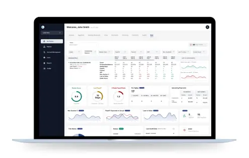
Dashboard serves as a visual representation of data, consolidating complex information into a concise and organized format. It allows users to quickly grasp the current state of affairs, monitor trends, and make informed decisions. By presenting data in a visually appealing and intuitive manner, dashboards enhance the accessibility and usability of information.
Data Exploration And Analysis
Dashboards facilitate data exploration and analysis. By providing interactive elements and filtering options, users can customize their viewing experience and delve deeper into specific data points or metrics that are relevant to their needs. This empowers users to extract valuable insights, identify patterns, and make data-driven decisions efficiently.
Enhances Aesthetic Appeal
Dashboards contribute to the overall aesthetic appeal and branding of a product or platform. A well-designed dashboard with a visually pleasing layout, coherent color scheme, and appropriate typography creates a positive impression and instills confidence in users. It reflects the attention to detail and professionalism of the product or service, thereby enhancing the overall user experience.
Simplifies Complex Data
Dashboards enable users to gain insights and derive meaning from data effortlessly. Through the use of data visualization techniques such as charts, graphs, and infographics, complex datasets can be transformed into easily understandable visual representations. This not only saves time but also reduces the load, enabling users to focus on interpreting the data rather than decoding it.
Enhances User Experience
Dashboards contribute to the overall aesthetic appeal and branding of a product or platform. A well-designed dashboard with a visually pleasing layout, coherent color scheme, and appropriate typography creates a positive impression and instills confidence in users. It reflects the attention to detail and professionalism of the product or service, thereby enhancing the overall user experience.
Here are the details of tips that will help UX/UI Designers to make an Appealing Dashboard Design.
Enhance Visual Appeal
A visually captivating dashboard design not only catches the user's attention but also engages them in a meaningful way.Enhancing the visual appeal of a dashboard is of utmost importance for several reasons. Firstly, a visually appealing dashboard captures the user's attention and creates a positive first impression. Users are more likely to engage with a well-designed and visually appealing interface, leading to increased user satisfaction and retention. A visually appealing dashboard contributes to the overall user experience by creating a sense of professionalism and trust. A visually cohesive and aesthetically pleasing design instills confidence in users, making them more likely to rely on the information presented in the dashboard.Another important aspect of enhancing visual appeal is customization. Allowing users to personalize the appearance of the dashboard, such as choosing color themes or rearranging elements, creates a sense of ownership and tailors the experience to individual preferences. This customization can enhance user engagement and satisfaction.There are a few ways to enhance the visual appeal of Dashboard Design. These include:
Clean And Intuitive Designs
To enhance the visual aspect of a UX dashboard, UX/UI designers should focus on employing clean and intuitive design principles.
Keep Minimalistic Approach
A minimalist approach, with a balanced use of colors, typography, and whitespace, can create a visually pleasing and uncluttered interface.
Consistency
Consistency in design elements, such as icons, buttons, and layouts, contributes to a cohesive and professional look.
Data Visualization
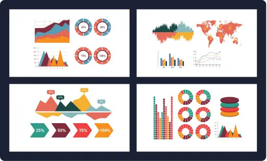
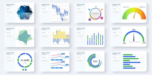
Furthermore, incorporating effective data visualization techniques, such as charts, graphs, and infographics, helps users comprehend complex information at a glance.
Visual Clarity
Attention should be paid to choosing appropriate chart types and ensuring visual clarity.
Subtle Animations
Adding subtle animations and transitions can enhance the interactivity and delight users by providing a sense of fluidity and responsiveness.
Visual Hierarchy
By prioritizing visual hierarchy, emphasizing important information, and maintaining a consistent visual language, designers can create a visually stunning UX dashboard that not only appeals to users but also enhances their overall user experience.
Focus On Interactivity Design
One valuable tip to create an appealing dashboard is to focus on interactivity design. Interactivity adds an engaging and dynamic element to the dashboard, elevating the user experience to new heights. By focusing on interactivity design, UX/UI Designers can create an appealing dashboard that not only captivates user’s attention, but also encourages exploration and provides a truly interactive user experience. There are a few ways which can help UX/UI Designers to focus on interactivity of the dashboard design and help them create an interactive dashboard:
Interactive Elements
By incorporating interactive elements, such as clickable buttons, filters, and drill-down functionalities, users can actively explore and interact with the data, making the dashboard more intuitive and user-friendly.
Charts And Graphs
Add Interactive charts and graphs that respond to user interactions, such as hovering or clicking, provide instant feedback and enable users to delve deeper into specific data points.
Data Visualization
Incorporating interactive data visualizations, such as sliders or toggles, allows users to manipulate and customize the data presentation according to their needs. This level of interactivity not only empowers users to actively engage with the dashboard but also enhances their understanding and analysis of the information.
Contextual Information
Utilize hover effects and tooltips to provide contextual information. When users hover over data points or elements, tooltips can display additional details, explanations, or even visual cues, helping users gain insights without cluttering the dashboard.
Exporting Of Data
Allow users to export or share data from the dashboard. Providing options to download data in various formats, such as CSV or PDF, or sharing functionality through email or social media, empowers users to collaborate, present insights, or further analyze the data outside of the dashboard.
By focusing on these strategies, UX/UI designers can create an interactive dashboard that not only engages users but also empowers them to explore, analyze, and extract meaningful insights from the data presented.
Provide Clear And Concise Information
To create an appealing dashboard, it is essential to provide clear and concise information. Clarity in presenting data ensures that users can quickly and accurately comprehend the information displayed. By giving clear and concise information, designers can create an appealing dashboard that not only captivates users visually but also provides them with valuable and easily understandable insights. Here are a few valuable tips for UX/UI Designers that will help them in providing clear and concise information through their dashboard design:
Easily Understandable
By giving clear and concise information, UX/UI designers can create an appealing dashboard that not only captivates users visually but also provides them with valuable and easily understandable insights.
Use Of Keywords
Using keywords and concise language can help to communicate key insights effectively.
Clear Headings
Utilizing clear heading, annotations and labels can help UX/UI Designers to guide users through the dashboard.
Readable Texts
Ensure that the text and visuals are legible and easily readable. Use appropriate font sizes, contrast, and whitespace to enhance readability. Pay attention to color choices to ensure accessibility and avoid color combinations that hinder readability.
Visual Hierarchy
Employ visual hierarchy techniques to guide users' attention to the most important information. Use size, color, and typography to differentiate between primary and secondary elements. The most critical data should be visually prominent, while less important information can be presented with subtle visual cues.
By implementing these strategies, designers can effectively give clear and concise information in a dashboard, creating an appealing and user-friendly interface that facilitates quick understanding and decision-making.
Focus On Simplicity
When creating an appealing dashboard, one important tip is to focus on simplicity. This applies to dashboard design for software development, UX/UI designers, data analytics, and business intelligence. By following simple dashboard design tips and adhering to minimalist dashboard design principles, designers can achieve a clean and uncluttered layout that promotes ease of use and enhances the overall user experience. Emphasizing simplicity involves removing unnecessary elements and reducing visual noise, allowing users to quickly and intuitively navigate the dashboard. Interactive dashboard design strategies can be employed to strike a balance between providing essential functionalities and maintaining simplicity. Additionally, personalized dashboard design techniques can tailor the experience to individual user needs, enhancing usability and engagement. By focusing on simplicity, designers can overcome challenges such as avoiding common mistakes and resolving issues related to excessive information. This approach ensures that the dashboard's functionality is enhanced, delivering a better user experience. In the realm of performance and metrics, simplicity can be achieved by identifying key metrics, tracking KPIs, and utilizing real-time data to provide relevant and actionable insights. Ultimately, a simplified and user-centric dashboard design, aligned with the psychology of users, ensures a seamless and effective user experience.
There are a few ways to enhance simplicity in creating an appealing dashboard. These include:
Simplifying Layouts
Simplify the overall layout by removing unnecessary elements and focusing on the most important information. Avoid cluttering the dashboard with excessive charts, graphs, or widgets. Embrace a clean and spacious design that allows users to easily navigate and digest the displayed data.
Limited Color Palette
Opt for a limited color palette that complements the brand or the purpose of the dashboard. Use colors strategically to highlight key elements and create visual hierarchy. Avoid using too many vibrant colors or conflicting color combinations that can distract or overwhelm users.
Focusing On Meaningful Data
Focus on displaying relevant and meaningful data that aligns with the goals and objectives of the dashboard. Avoid presenting unnecessary or irrelevant information that may confuse or distract users. Keep the data concise and ensure it provides actionable insights.
Utilizing White Space
Utilize white space (negative space) effectively to create a sense of visual balance and enhance readability. Give elements room to breathe and avoid cramming them too closely together. White space allows users to focus on the essential elements and improves overall aesthetics.
Using Data Visualization
Use simple and clear data visualization techniques to present information effectively. Choose the appropriate chart types that best represent the data and make it easy to understand. Avoid using complex or overly intricate visuals that may confuse users.
By implementing these strategies, UX/UI designers can add simplicity to dashboard designs, creating a clean, intuitive, and appealing interface that allows users to easily access and comprehend the presented information.
Consider The User Experience
When creating an appealing dashboard, it is crucial to focus on user experience. This principle holds true for dashboard design in software development, UX/UI designers, data analytics, and business intelligence. By applying simple dashboard design tips and adhering to minimalist design principles, designers can create a user-centric experience that prioritizes the needs and goals of the users. Interactive dashboard design strategies can be employed to enhance user engagement and make the dashboard more intuitive and engaging. Personalized dashboard design techniques can be utilized to tailor the experience to individual users, providing them with relevant and customized insights. By understanding user needs, considering the psychology of dashboard design, and incorporating user experience considerations, designers can create a dashboard that is intuitive, visually appealing, and easy to navigate. Customizable dashboards allow users to personalize their experience and access the information that is most relevant to them. Additionally, focusing on performance and metrics ensures that key metrics and real-time data are presented effectively, empowering users to track KPIs and make data-driven decisions. Ultimately, a user-centric approach to dashboard design, combined with an emphasis on user experience, leads to the creation of an appealing dashboard that successfully engages users and delivers value.
Focusing on User Experience provides many benefits which include:
Increases Usability
By prioritizing user experience, designers can ensure that the dashboard is intuitive and easy to use. A well-designed interface with clear navigation, intuitive controls, and organized information allows users to quickly and efficiently access the desired data, leading to enhanced usability.
Improves User Satisfaction
A user-centric approach to dashboard design enhances user satisfaction. When users find the dashboard easy to navigate, visually appealing, and tailored to their needs, they are more likely to have a positive experience and feel satisfied with the overall usability of the dashboard.
Enhances Decision Making
A well-designed dashboard that focuses on user experience empowers users to make better-informed decisions. By presenting data in a clear and visually compelling manner, users can quickly interpret and understand information, leading to more effective decision-making processes.
Increases Productivity
A user-friendly dashboard design enables users to accomplish tasks more efficiently, leading to increased productivity. With easy access to relevant data, intuitive navigation, and streamlined interactions, users can perform their tasks effectively and save valuable time.
Competitive Advantage
Focusing on user experience in dashboard design can provide a competitive edge. A well-designed and user-friendly dashboard stands out from the competition, making it more attractive to potential users or clients. It can become a differentiating factor that sets a product or service apart in a crowded market.
In summary, prioritizing user experience while creating an appealing dashboard leads to increased usability, improved user satisfaction, better decision-making, enhanced productivity, reduced learning curve, higher user engagement, increased adoption and retention, and a competitive advantage. By understanding and meeting the needs of users, UX/UI designers can create a dashboard that delivers value, fosters user satisfaction, and drives the success of the product or service
.webp)
Craft Design Solutions That Fit Your Needs
When creating an appealing dashboard, it is essential to consider design solutions that fit your specific needs. Whether you are designing a dashboard for software development, UX/UI designers, data analytics, or business intelligence, understanding your requirements is crucial. By following simple dashboard design tips and embracing minimalist design principles, you can create a visually pleasing and clutter-free interface. To enhance user engagement, interactive dashboard design strategies can be employed, such as incorporating interactive elements, visualizations, and intuitive navigation. Personalized dashboard design techniques can also be implemented to cater to individual user preferences and needs, ensuring a tailored and relevant experience. Overcoming challenges in dashboard design involves avoiding common mistakes, such as resolving issues with excessive information that can overwhelm users. Enhancing dashboard functionality is another key aspect, ensuring that it provides a seamless user experience and delivers the desired insights. When comparing different types of dashboards, it's important to choose the right chart types that effectively represent the data being presented.Additionally, understanding user needs and considering the psychology of dashboard design contributes to a user-centric approach. Customizable dashboards allow users to personalize their experiences, while tracking key metrics and incorporating real-time data enhances the dashboard's effectiveness. Ultimately, by focusing on design solutions that align with your specific needs, you can create an appealing dashboard that meets your objectives and delivers a satisfying user experience.
Work With An Experienced Design Team
One of the crucial tips to create an appealing dashboard is to work with an experienced design team. When it comes to designing a dashboard, the expertise and knowledge of an experienced team can make a significant difference. Whether you are developing a dashboard for software development, UX/UI designers, data analytics, or business intelligence, collaborating with professionals who have a deep understanding of dashboard design principles is invaluable.
Here are some reasons why working with an experienced design team beneficial while creating an appealing Dashboard:
- An experienced design team brings a wealth of expertise in user interface (UI) and user experience (UX) design, ensuring that the dashboard is visually appealing, intuitive to use, and aligns with industry best practices.
- They have a keen eye for detail, considering factors such as information hierarchy, data visualization techniques, and interactivity to enhance user engagement.
- Moreover, an experienced team is well-versed in overcoming challenges commonly faced during dashboard design, including avoiding design pitfalls and effectively resolving issues with excessive information.
- By leveraging their expertise, you can tap into their problem-solving capabilities and benefit from their knowledge of user-centric design considerations.
- Ultimately, collaborating with an experienced design team empowers you to create an appealing dashboard that not only meets your objectives but also delivers an exceptional user experience.
Benefits OF Dashboards
Dashboards are proven to be very beneficial in the world of UX/UI Designs. However five of these benefits are described below:
Data Visualization
Dashboards in UX/UI design offer the benefit of visually representing complex data in a simplified and digestible format. By using charts, graphs, and visual elements, dashboards allow users to quickly understand and interpret data, facilitating informed decision-making.
Real Time Monitoring
Dashboards provide real-time data updates, enabling users to monitor key metrics and performance indicators in real-time. This real-time monitoring allows for timely insights and empowers users to take immediate action based on the current state of the data.
Customization And Personalization
Dashboards can be customized and personalized to suit individual user preferences and needs. Users can choose which metrics, charts, or visualizations they want to see, allowing for a tailored and personalized user experience. This customization enhances usability and ensures that users can focus on the information that matters most to them.
Data-Driven Insights
Dashboards facilitate data-driven decision-making by presenting data in a meaningful and actionable manner. By providing clear visualizations and interactive features, dashboards enable users to explore and analyze data, uncover trends, and gain valuable insights that drive business success.
Conclusion
In conclusion, designing an appealing dashboard requires careful consideration of user interface (UI) and user experience (UX) principles. By following the tips mentioned in this blog, you can create a dashboard that not only looks visually stunning but also enhances usability and efficiency. Remember to keep the design simple and clutter-free, prioritize essential information, use appropriate color schemes and typography, implement intuitive navigation, provide meaningful data visualizations, ensure responsiveness across devices, and seek user feedback for continuous improvement. By incorporating these seven amazing UI/UX tips into your dashboard design process, you can create a visually appealing and user-friendly experience that will impress your users and enhance their productivity.
To avail our offered services by Professionals kindly Contact Us.
Awards & Achievements

Best UI UX Design
Firm 2023

Top Design Agency
Firm 2024

Google Partner
Premier 2023

Top Website
Designers

Best UI UX Design
Agency 2023
