How to Choose the Best Color Palette for Your User Interface
Written by UIDesignz Jul 24, 2023 5 min read
Last updated: Feb 12 2024
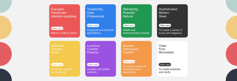
In the ever-changing field of web design, picking the right color scheme for your user interface (UI) is more than just about looks. Colors significantly impact how users perceive, feel, and recognize a brand.
This comprehensive guide, created by UIDesignz, a leading UI UX design agency, breaks down the process of selecting a compelling and effective color palette into 9 practical steps. It's designed to be easily understood by all readers, ensuring a user-friendly experience.
Table of Contents
Quick Course in Color Theory
Before going towards color selection, it's important to understand the fundamentals of color theory. Rooted in Isaac Newton's color wheel, this theory includes primary, secondary, and tertiary colors, along with variations like hue, shade, tint, and tone. Familiarising yourself with these principles lays the groundwork for making informed and thoughtful color choices. According to Newton’s color wheel.
- Primary Colors: Red, blue, and yellow, fundamental and cannot be created by mixing.
- Secondary Colors: Green, orange, and purple, result from combining two primary colors.
- Tertiary Colors: Formed by blending a primary color with a neighbouring secondary color.
- Hue: Represents the pure form of a color (e.g., pure red or pure blue).
- Shade: A darker version of a color, created by adding black.
- Tint: A lighter version of a color, achieved by adding white.
- Tone: Refers to the intensity or brightness of a color, influenced by adding grey.
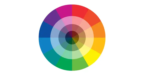
Color Theory (image by Wordpress)
What is a Color Palette?
A color palette is a collection of colors chosen for a specific purpose or design. It consists of a set of coordinated colors that work well together and are used in various design system service elements of a project, such as backgrounds, text and accents. A thoughtfully selected color palette enhances visual appeal and maintains a cohesive and harmonious look throughout a design or presentation.
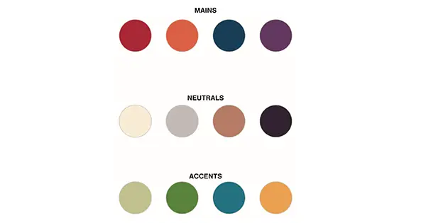
Color Palette (image by Cladwell)
Why is a Color Palette Important for Your Website?
A carefully designed color palette is like the base of your brand. It affects how users experience and recognize your brand and identity services. It makes things look consistent, easier to use, and helps your brand stand out from others. A good color palette is like a visual language that tells your brand story well.
How to Choose Your Color Palette in 9 Steps
Consider these 9 steps carefully chosen, arranged and written for your help to select a color palette for your design and brand.
1. Get to Know Your User Base
Knowing your audience well is important. Make user personas, study demographics, and find out what traits and expectations your audience has. Thorough research makes sure the colors you choose match what your target audience likes.
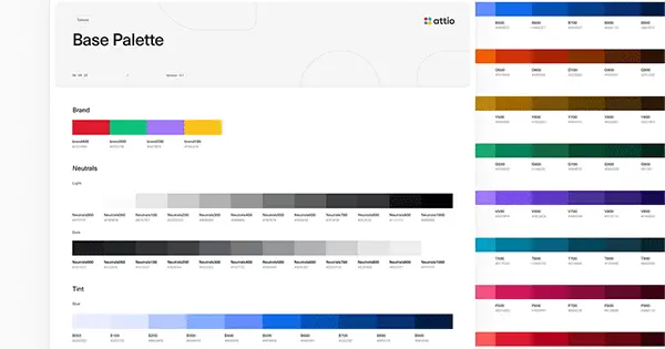
Color Base (image by Dribble)
2. Get Inspired
Find ideas by making mood boards, checking out favourite websites, and studying successful color palettes. Platforms like Dribbble and Behance are great places for design inspiration.
3. Use Color Psychology
Learn about color psychology to understand how colors affect people's moods and behaviour. Think about things like warmth, trustworthiness, energy, and peace when choosing colors that match your brand's message.
View More: Doctor Q UI Kit
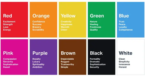
Color Psychology (image by Londonimageinstitute)
4. Start with Greyscale
Design a preliminary version using shades of grey to emphasise usability over looks. Sketch out each page, paying attention to the arrangement and empty spaces. This method guarantees a clear order of elements before adding color.
5. Reflect on What Colors Go Well Together
Use a color palette with a maximum of six colors. Choose one main color, one standard color for text, and two accent colors. Aim for color harmony that mirrors your brand's personality and style.
6. Add in Some Contrast
Maintain a balanced color contrast to ensure UI elements stand out clearly. Try subtle and soft contrasts for a unified design, reserving strong contrasts strategically for important elements like call-to-actions.
Read More: Designs Better Gradients with these Awesome Tips
7. Use the 60-30-10 Rule
Keep balance using the 60-30-10 rule, assign 60% to the main color, 30% to the second color, and 10% to the accent color. This formula guarantees a visually pleasing experience.

60-30-10 Rule (image by Medium)
8. Adhere to UI Design Conventions
Encourage creativity but follow UI design norms for accessibility and user familiarity. Use dark text for readability, light backgrounds, and traditional call-to-action colors consistently to create an intuitive interface.
9. Time for User Testing
Test your color choices with users. Gather feedback early in the design process to ensure your interface has a positive impact. Always prioritise the user experience.
Conclusion
Selecting the right color palette for your UI UX agency is more than just a visual choice; it's about creating a seamless and meaningful experience for your audience. Understanding color theory, creating user personas, and following design principles contribute to a successful palette. Remember, your color choices reflect your brand's identity and influence how users perceive it.
To avail our offered services by Professionals kindly Contact Us.


