Mastering Typography: Expert Tips for UX UI Designers in 2026
Written by UIDesignz Mar 8, 2023 4 min read
Last updated: Jan 7 2026

Typography, the art of arranging type, plays an important role in UI UX design service. At UIDesignz, we understand the significance of effective typography in conveying messages and creating visually appealing designs. In this guide, we'll explore the importance of mastering typography for CX, UX and UI designers and provide valuable tips to enhance your design skills.
Table of Contents
Importance of Typography in CX, UX and UI Designs
Typography is more than just selecting fonts; it's about creating a visual language that communicates effectively. Here's why mastering typography is important for UX UI designers.
- Communication: Well-executed typography ensures clear communication of messages to users.
- Visual Hierarchy:Typography establishes a hierarchy, guiding users to prioritise information.
- Brand Identity:Fonts contribute to brand and identity services, conveying the personality and tone of a brand.
- Aesthetics and Readability:Proper typography enhances the overall aesthetics and readability of a design.
Tips for Mastering Typography
1. Consistent Font Usage
Consistent font usage means using the same or similar fonts throughout a design. Here's why it's important.
Look Nice
When all the words have a similar style, it makes the website design look neat and organised.
Brand Stays the Same
Using the same fonts helps keep a brand's identity and personality consistent in different materials.
Easy to Read
When people see the same font, it's easier for them to read and understand the information without getting confused.
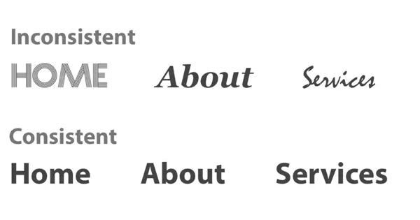
Consistent Font Usage (image by oxosolution)
2. Alignment for Readability
Aligning text to the left helps make words easy to read. Here's why it matters.
Follows Natural Flow
Left alignment mimics how we naturally read from left to right, making text more accessible.
Clean and Clear
It creates a clean and clear design, making it easy for the eyes to follow the words without confusion.
User-Friendly
Left-aligned text is user-friendly, ensuring a comfortable reading experience for everyone.
3. Font Selection
Choosing the right fonts is important for a good design. Here's why it matters.
Clear and Easy to Read
Picking fonts like Avenir or Helvetica ensures words are clear and easy to read.
Matches the Theme
The chosen font should match the theme or style of the project, keeping it consistent.
Users Personality
Fonts like Arial or Times New Roman convey different feelings, so pick one that matches the personality you want.
Read More: Mastering Custom Web Design Trends in 2024
Font Selection (image by Github)
4. Contrast for Emphasis
Using differences to make things stand out is important in design. Here's why it's done.
Highlight Important Stuff
Contrast, like making words bold or bigger, helps draw attention to important information.
Avoids Monotomy
It keeps the design interesting by avoiding everything looking the same.
Easy to Understand
If you double the size of a word, like making a heading bigger, it shows it's important.
5. Double Up or Down
Changing the size of words in a simple way is helpful for good design. Here's why.
Show Importance
If you double the size of a word, like making a heading bigger, it shows it's important.
Maintain Consistency
Doubling or halving the size keeps a consistent look, making the design more organised.
Clear Hierarchy
It helps create a clear order, guiding people to know what to read first and what comes next.
6. Contextual Font Use
Choosing the right font for the situation is important in design. Here's why it matters.
Fits the Theme
The font should match what you're working on, like using a fancy font for a celebration.
Maintain Consistency
By picking a font that suits the context, you keep a consistent look throughout the project.
Enhances Message
The chosen font helps convey the right mood or message, making the design more effective and appealing.

Contextual Font Use (image by typenetwork)
7. Organised Grouping
Putting similar things together neatly is important in design. Here's why it's done.
Looks Tidy
Grouping similar information in blocks makes the design look organised and tidy.
Clear Structure
It creates a clear structure in the design, helping users navigate and find information effortlessly.
Conclusion
In the world of CX, UX, and UI design, mastering typography is key for effective communication and visually appealing designs. By consistently using fonts, aligning text for readability, making wise font selections, and embracing continuous learning, designers at UIDesignz ensure a great user experience. Remember, good design is a journey of growth, and at UIDesignz, we're committed to evolving with every project to bring you the best in design innovation.
To avail our offered services by Professionals kindly Contact Us.
Awards & Achievements

Best UI UX Design
Firm 2023

Top Design Agency
Firm 2024

Google Partner
Premier 2023

Top Website
Designers

Best UI UX Design
Agency 2023
