Designs Better Gradients with these Awesome Tips
Written by UIDesignz Aug 10, 2023 5 min read
Last updated: Feb 6 2024
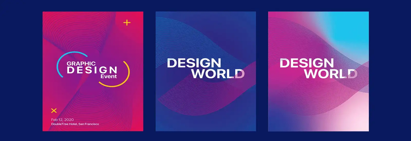
A gradient is a smooth shift from one colour to another, creating a blended transition. For UIDesignz, a UI UX design agency, gradients are very important. They introduce depth and realism to designs, making objects stand out and adding a new dimension. Gradients allow designers to create unique colours, enhancing the visual appeal of websites and applications. In essence, they bring life and sophistication to user interfaces.
Gradient Types: A Quick Guide by UIDesignz
Understanding these gradient types empowers designers to choose the right style for different design needs, enhancing the overall user experience.
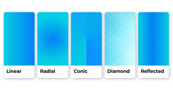
Gradient Types (image by TAILOR BRANDS)
Linear Gradients
- Colours smoothly transition in a straight line, creating a seamless flow.
- Ideal for background elements, headers, and straightforward design enhancements.
Angular Gradients
- Colours transition in a circular pattern, creating a dynamic and angular effect.
- Suitable for backgrounds, illustrations, or designs where a more energetic feel is desired.
Keep Reading: Choose the Best Color Palette for Your User Interface
Radial Gradients
- Colours radiate from a central point, creating a circular transition.
- Great for adding depth to buttons, logos, or elements requiring a centred focal point.
Diamond Gradients
- Colours shift diagonally, forming a diamond-shaped transition.
- Great for adding depth to buttons, logos, or elements requiring a centred focal point.
Conical Gradients
- Colours blend in a circular motion, creating a cone-like effect.
- Perfect for creating dynamic and eye-catching elements, such as icons.
Tips for Better Gradients
It is important to learn how to use gradients correctly in design. From making things look good to generating emotions and building brand and identity services, gradients work together with all other design elements. Gradients also play a role in making the user experience smooth and are important for accessibility. We've put together some fantastic tips for you to make the most out of gradients in your designs.

Tips for Better Gradients (image by Centre Colours)
Explore Analogous Colours
Make your design look great by using similar colours that blend well together in gradients. Try different levels of brightness for a subtle or more eye-catching look, finding the right balance between a cohesive design and adding your creative touch.
Embrace Monochromatic Gradients
Choose one colour and use different shades for a stylish and simple look that is easy to read. Pick the main colour from your brand's set of colours to make your designs look polished and coordinated. This way, your designs will have a sophisticated appearance while keeping things minimal and easy to understand.
Gradient Enhanced Headings
Make important headings stand out by using colours that sharply contrast or blend well together. Keep it simple with subtle gradients for a modern and clean appearance. Ensure the heading fits smoothly with the overall design for a polished look. This way, your headings will catch the eye without being overwhelming, giving a professional touch to your design.
SEO Advantages (image by Globalization Partners)
Gradients in Quotes and Text
Turn ordinary text into eye-catching statements by using gradients that match the colours. Try different fonts, styles, and sizes, making sure the text is easy to read and meets accessibility standards. Experimenting with these elements will enhance the overall look of your text, making it both visually appealing and accessible to everyone.
Keep Reading: Choose Right Typography for Your Project
Create Smooth Transitions
Make sure your design looks smooth and professional by using gradient tools in design software. Check how your gradients appear on different web browsers to ensure a seamless and pleasant experience for all users. This way, your design will have a polished look and work well across various platforms, enhancing the overall user experience.
Utilise Best Practices for Logos
Create simple gradient logos that are memorable and timeless to represent your brand effectively. Make sure your logo looks good on different backgrounds and can be resized without losing quality. Testing the logo in different situations ensures it stays consistent and recognizable across various applications. This way, your brand will have a strong and reliable visual identity.
Gradient Transitions
Guide the viewer's eyes smoothly through your design by using sleek gradient transitions. Use gradients as backgrounds and highlight important elements with gentle colour changes to create eye-catching focal points. This technique adds visual appeal and makes key elements stand out, enhancing the overall design.
Avoid Common Mistakes
Avoid using bright and confusing gradients that distract from your message, aim for a balanced design. Check the colour contrast to ensure your design is easy to see for everyone, and consider how it looks on different devices. This way, your design will be effective and visually pleasing to a wide audience.
Enhance Body Copy Readability
Ensure that the text is easy to read by keeping a good contrast between the body copy and the background colours with gradients. Think about the size and style of the font, and test how the gradients look with different lengths of text. This way, you can strike a balance between being creative and making sure the reader has a good experience.
Conclusion
Understanding and mastering the use of gradients is key to creating visually stunning designs. UIDesignz, a UI UX design agency in USA, recognizes the importance of gradients in adding depth and realism to designs, making them stand out. By exploring various gradient types and following practical tips, designers can enhance user experiences and can create memorable plus sophisticated user interfaces. So, whether it's choosing analogous colours or creating smooth transitions, these insights empower designers to elevate their gradient game and create designs that attract and relate.
To avail our offered services by Professionals kindly Contact Us.
Awards & Achievements

Best UI UX Design
Firm 2023

Top Design Agency
Firm 2024

Google Partner
Premier 2023

Top Website
Designers

Best UI UX Design
Agency 2023
